
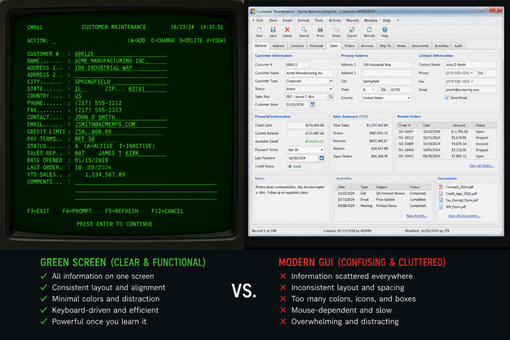
After completing my last post, Are Mainframe Computers Still Around?, I started thinking about one of my biggest complaints with modern graphical interfaces: navigation.
As far as I’m concerned, most modern navigation SUCKS. From websites to desktop applications, finding what you need and getting where you want to go is often far more difficult than it should be.
Don’t get me wrong, I do understand that the graphic interfaces were created to make navigation easier to understand and can be designed for the visually impaired. But so many designs look like the only thought that was involved in the designed was to make things pretty. And no thought was given to how a user needs to find and use. Let’s start with some very basic user interface design. Do not, and I repeat, do not use colors that strain the eyes just because you like the color.
Seriously, there can be actual health concerns involved with some color choices. Even when there aren’t, poor choices can cause eye strain, which affects a person’s ability to use the application or website in the first place.
And God forbid you decide to get creative with the text color. Some people flat out can’t see it, or can’t distinguish it well enough from the background to comfortably read it.
A green screen may be ugly as sin, but there’s something to be said for it: it’s easy to see and easy to read.
What I described above is something I see far more often on web pages than I do in desktop applications or mobile device interfaces. Speaking of web page design, have you ever been to a government website? Or the website of a large business? Good luck trying to find something. It’s like looking at spaghetti thrown against a wall and trying to find the meatball. It’s almost downright impossible.
Now, I understand that these sites contain a tremendous amount of information. But it really makes me wonder whether they ever tested them with actual users outside the government or business, or if they were only tested by their own personnel.
The problem I’m describing here isn’t really caused by graphics. It’s that there is simply too much information buried under layers of navigation, government acronyms, business acronyms, and terminology that may make perfect sense to the people who work there but means absolutely nothing. Now, let’s move on to desktop and mobile applications. This is where you really start to see the problem of graphics and navigation burying things.
When you add graphics, icons, buttons, and other navigation elements to a screen, you are using space that could otherwise be used to display information or offer additional choices. If an application has a lot of information to display or a lot of actions a user can perform, those choices have to go somewhere.
The result is often more menus, more screens, more buttons, and more layers of navigation. Instead of seeing your choices in front of you, you have to keep navigating through a number of different screens. The point I’m trying to make here is simple: don’t add graphics just because you can. Graphics should serve a purpose.
Provide tool tips when a user hovers over something. Provide help popups or other guidance that helps users work their way through the different options an application provides. Don’t make people guess what an icon means or where they need to go next.
Dump the eye candy you added just because it looks good, and think about usability when designing the interface. Looking good is fine, but the interface still has to be easy to use. Now, let’s move on to grouping information. Because there is less room on a screen when you use graphics, serious thought has to be given to how information is grouped and how the user moves from one screen to the next.
Your primary screen should provide a simple overview that breaks the information into logical groups and gives the user an obvious way to get to the details for each item.
If there is simply too much information to fit everything on one screen, have you ever heard of the word Next?
It’s not fancy. It’s not clever. But it pretty much tells the user exactly what they need to know: there is more information related to what you’re looking at, and this is how you get to it.
Now, another problem I’ve seen in various applications, especially business applications, is that they offer so many different options and actions.
The thing is, most businesses probably never use everything that’s included in an off-the-shelf application. Commercial software has to meet the needs of many different businesses, so it ends up including features that one company may use every day while another company may never touch them.
If the application was designed in-house, that’s a little different. Presumably, what the application does was requested by the people who actually use it, so those options are there for a reason.
And honestly, even with the design of my own password vault, I’ll admit that I’ve added things that other people probably wouldn’t use right away. But the application was designed for my use. And I use it every day.
Look, graphical interfaces are never going away, and they shouldn’t. The basic green screen really only works well in certain environments, particularly business applications where large amounts of information need to be entered, displayed, and processed.
But we shouldn’t throw away the thought process that went into designing those old green screens.
The grouping of information, the navigation between screens, the placement of fields, and the thought given to how someone would actually use the application were all important parts of the design.
Those old design principles should still be part of designing modern graphical interfaces. We don’t need to bring back the green screen. But we could certainly bring back some of the basic thinking that made those screens so damn usable.
Pingback: Google Analytics and Your Web Page - Dans Geek Stop Blog